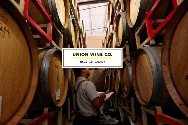
Union Wine Co.


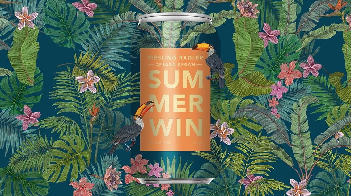
Union Wine Co. is an Oregon brand that had a down to earth approach to wine making and Pinot Noir that was getting some good press. We helped launch them onto the national stage through a bold design approach and emphasizing the power of being down to earth.
Creative direction
Art direction
Logo design
Packaging design
Experience design
Website design
Product development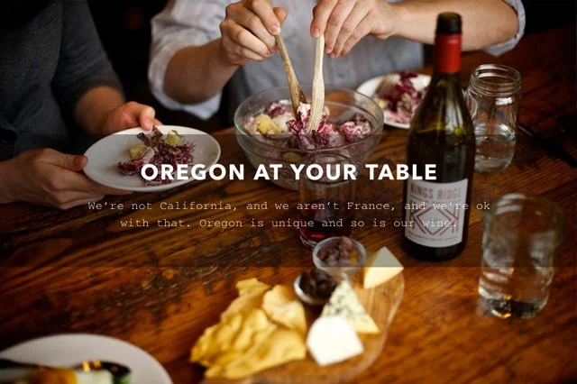
Oregon struggles with defining its wines, other than film references and pointing to similar latitudes in France and being north of California. Since it was wide open, we defined the value as the antidote to the fussiness many people dislike about the status quo in wines and created a movement.

Wine was a category that needed disruption. It was mired in old, tired codes of status and cliches. It was a delight to poke fun at it, while also defining a new sensibility based in honest craft. We noticed how craft beers was making moves into cans, which was unthinkable at the time, and a movement in wine was born.

We started our work by bringing some depth to the warehouse aesthetic they had as an asset, with a modern, industrial-craft sensibilty, referencing typographic posters from mid-century design pioneers as a starting point for exploration. We felt there was kinship with the ethos of the Bauhaus and the simplification of forms which was part of a design movement that embraced industrialization as a way to democratize good design and bring it to everyday people.
The concept of the tasting room also felt like it could use a nudge away from tired tropes, although still a wonderful part of the experience for many vineyards. Since Union Wine was different and rooted in sourcing and blending as their craft-making strength, we created a mobile tasting room that would “bring Oregon to your table”.

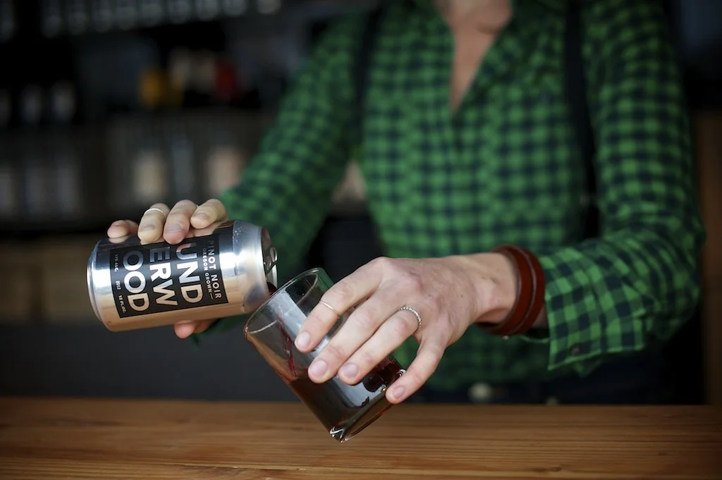
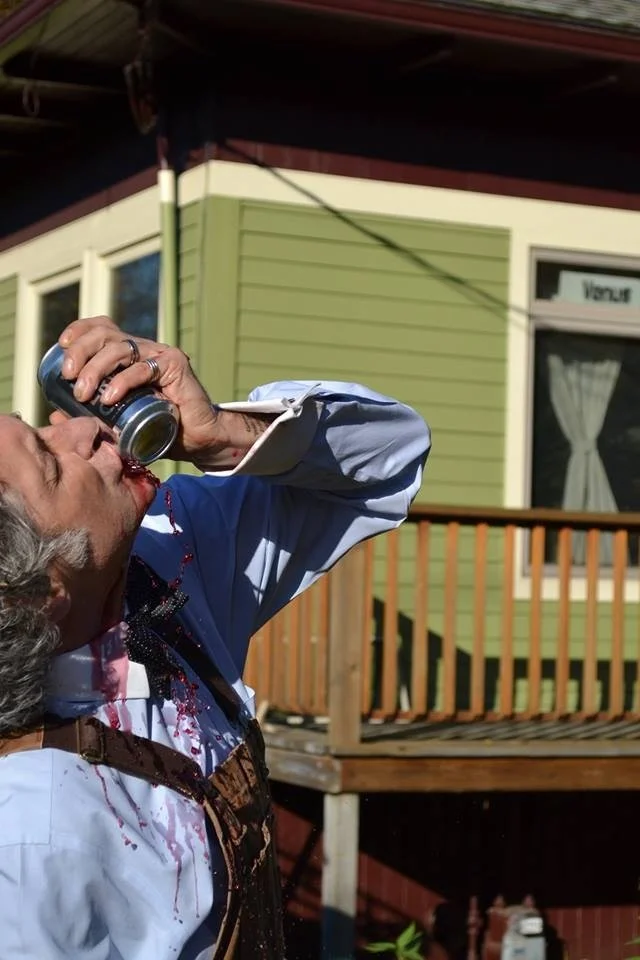
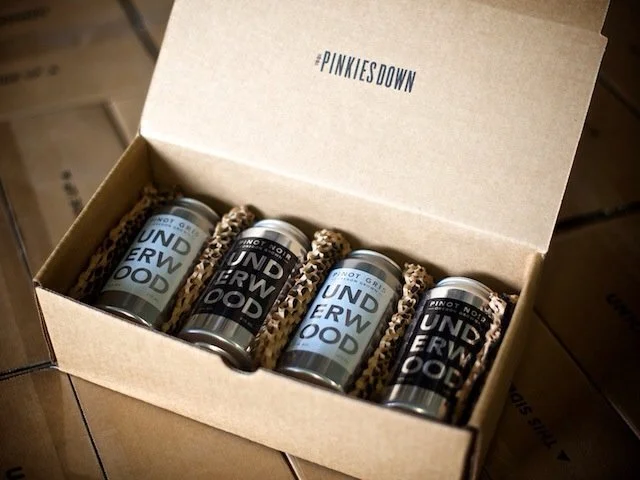
Putting Underwood in cans came out of a fun conversation about countering the current Portlandia-esque trend of overly earnest craft worship, that was rampant and going to be in high gear at a fancy food festival, named Feast that was about to jump the shark with craft ice cubes and the like.
We decided to try the can approach out with a few pallets, and created the “Pinkies down” campaign which included bands to tie your pinkie to your hand so you couldn’t raise it in the air to introduce the cans and our Oregon placemaking perspective.

Humor, and unexpected opportunities which were often absent in wine, became a part of the design as a cheeky sidekick.
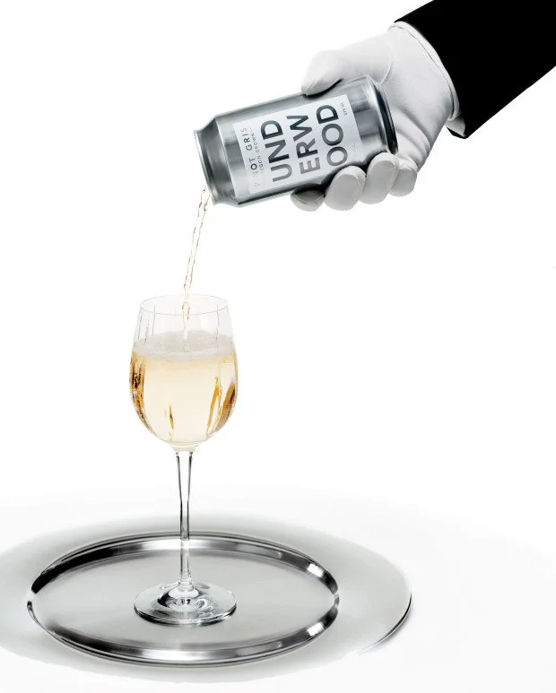
Many people hated it, but many more loved the idea of taking wine less seriously, and felt relief when that pretense was popped. Union Wine Co. is now the largest wine company in Oregon.

The design is simple and bold enough to play with the foreground and background in novel ways. The design system has become a platform for creative expression, generating interest from creatives and fans, alike. It sparked tons of UGC content and continues to express itself in myriad creative ways.