Free Public Wines
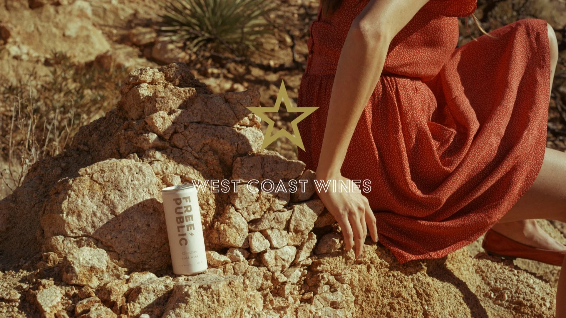
We designed Free Public as a west coast brand that made great canned wines. The design and symbolism we created, leaned heavily into the freedom of the open-road and an active outdoors lifestyle to drive home the essence of the what a canned wine offers.
Creative direction
Art direction
Logo design
Packaging design
Experience design
Website design
Product development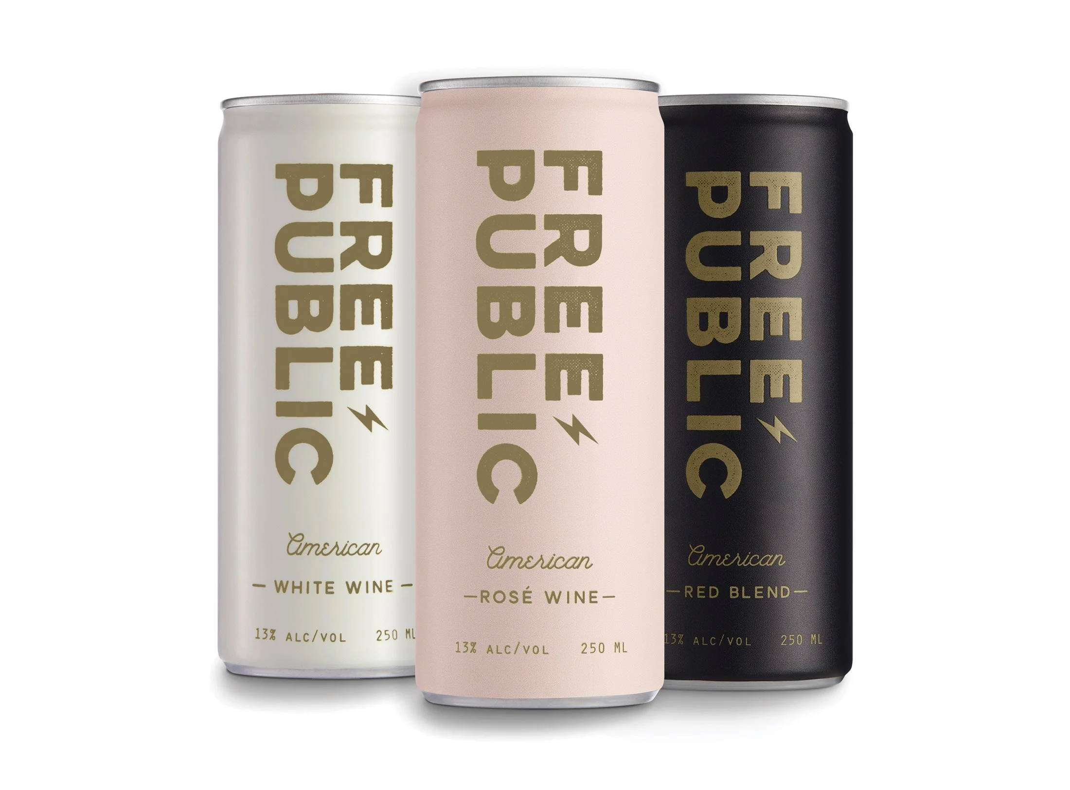
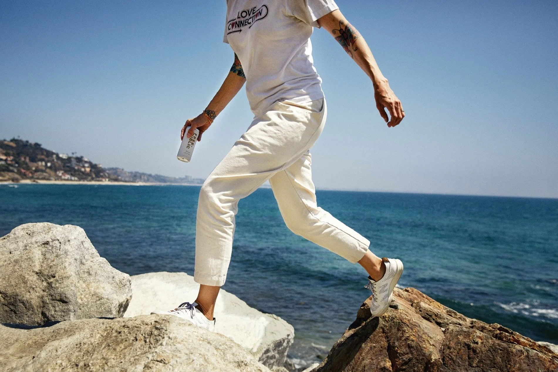
Free to roam and free to explore without the constraints of having the correct glasses to drink from, or even the weight of a bottle. Free Public built a photo-driven approach that captures some of the moments where we feel most free. Our photo partners were chosen for their evocative style and were critical to shaping the brand.

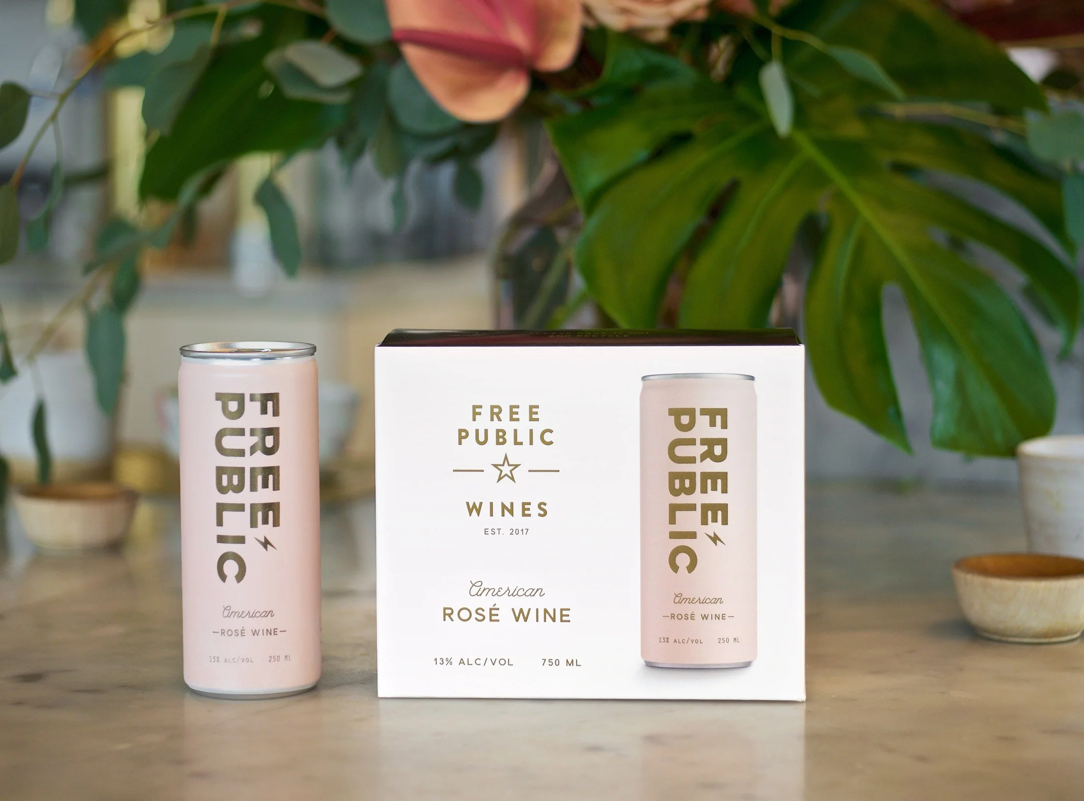
This was a different type of project, in that I was the client and created the brand from scratch to fill a void in the current canned wine movement.
I recruited others to the cause, did the initial fund-raise, internal and external team and board formation, and took out the trash, as they say. More than anything I am grateful to the people who took this seriously and helped us get traction in four states before the pandemic and White Claw took the floor away.
It was an invaluable experience to intimately know what small-business owners are dealing with alongside the brand needs on a daily basis.

Humbling and exhilarating, we wrestled with maintaining a balance with taking the wine very seriously but not the codes and cliches of luxury while still maintaining a level of sophistication.
In a category that, at the time was pretty cheesy, luxury expectations were fun to mess around with, but this also needed to be substantive and not fall into the myriad, hubristic traps that present themselves when you introduce something new.
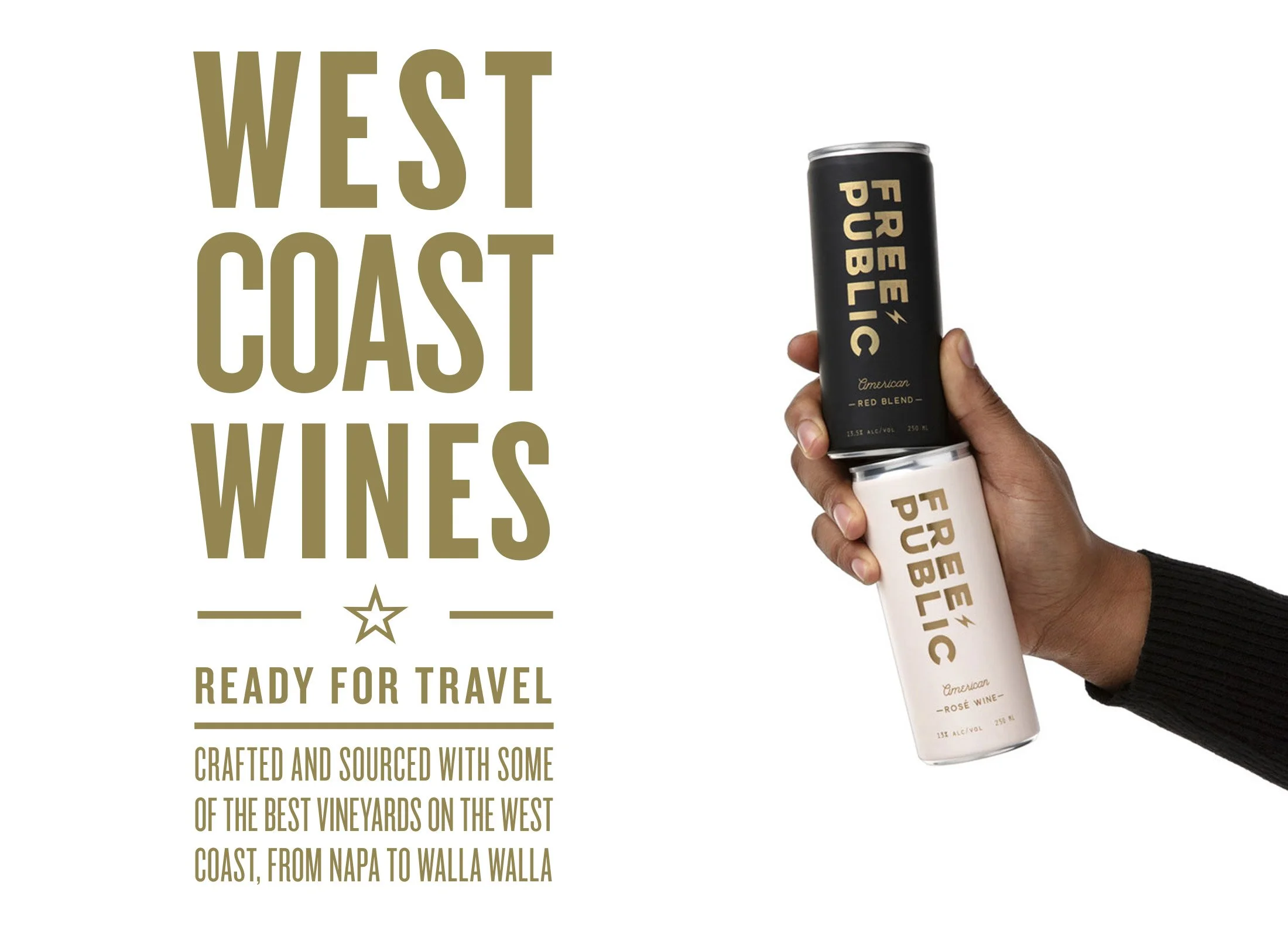
The American AVA has often been associated with bulk wines that needed a junk-drawer type of approach to contain the hidden sourcing.
We liked it for is ability to convey something different about open-ness and freedom to source where the best wines were available. This was because of our renowned wine-making partners who added weight and credibility to the freedom of sourcing as an intentional craft approach.

Free Public only came in cans. Cans were intended as the right choice for people who wanted to travel lighter, in terms of carbon footprint, as they are almost 100% recyclable and recycled due to their value. It also reduces shipping overhead, a savings that was spent on better wine.
It also made us the only true canned wine company (without a bottled wine prior) which obviously had it’s risks but also had a distinct clarity and focus.

Back to the brand art direction, we utilized illustrations of iconic elements from the cultural memory to reinforce the camp vibes we wanted to portray. We also added a collage aspect that captured a visual humor in places to keep things light and fun.


Humor, which was often absent in wine, became a part of the design as a cheeky sidekick voice to the brand. We found opportunities to fit into a just developing meme culture that were lighthearted and curious.

Taking things a little less seriously, is one of the reasons that we find that people enjoy having some wine with friends.

Adios, Free Public.
It was a blast.
